(for Visualization Designers and Visualization Researchers)
Key Takeaways
- Typographic parameters (a subtype of the shape visual variable) can be quite perceivable, and therefore offer much unexplored potential for use in visualization and infographics.
- But not all parameters are created equal, and some are much more useful: we studied weight, slant, x-height, width, contrast, serifs and aperture and found them better distinguishable by humans roughly in that order (weight and slant are most distinguishable).
- The best parameters (weight, slant, x-height and width) can be used to represent seven different categories of a categorical or ordered variable with reasonably low error rates.
- The perceptual curve shapes are different for each parameter.
InfoTypography
We define InfoTypography as:
The use of variations of letter shapes and their spatial arrangement within text to visually represent quantitative or qualitative information beyond the textual content.
In other words, InfoTypography is the use of type and typographic parameters to convey additional information about the words. InfoTypography is not new; for example, when you use a bold type to highlight a word in text, we are, essentially, mapping the weight of the font to one of two categories: very important (bold) or normal (not bold). Another common and very old example is how typographers use weight, width or slant of letters to convey the structure of a document (e.g., the different heading levels).
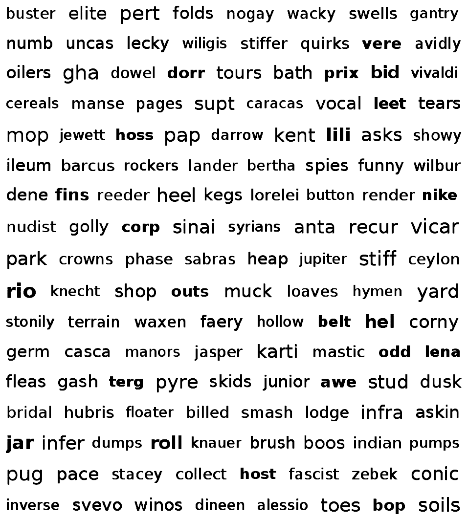
A more modern example of InfoTypography are tag clouds (or word clouds); most use size, but some use other parameters, such as the one below:
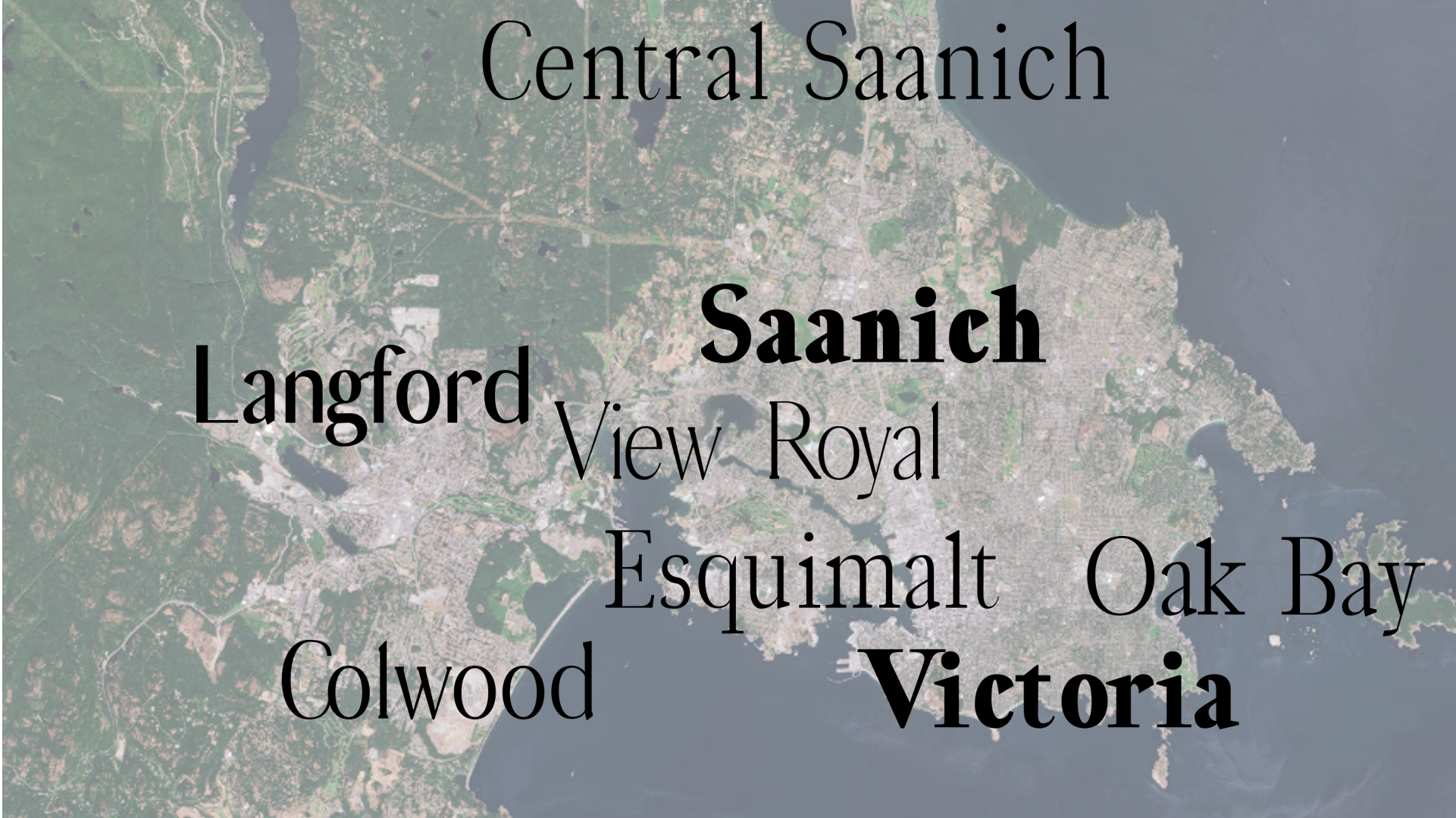
An additional example showcases a bit more the potential to use infoTypographic techniques in visualization or infographics. In the image below, a map contains the names of the towns using heavier weights for towns that are more populated and, simultaneously, uses more prominent serifs and higher contrast (that is, a more classic look) for towns that are older.
InfoTypographic techniques can be particularly useful to represent data that is linked to the text itself, but not contained in the text. For example, typographic parameters can map to how fast or slow a text should be said in a theatre play, or how loud.
Application of infoTypographic techniques is becoming increasingly easier due to the popularization of variable fonts and their support in most major browsers.
Finally, there are a couple of very interesting additional examples that you might want to check out. Shehzad Afzal and colleagues used infoTypographic techniques to generate typographic maps. And we used the shape of numbers to double encode quantities written with digits: FatFonts! (here is the paper, and here a website with many examples and downloadable fonts).
What did we study and what did we find?
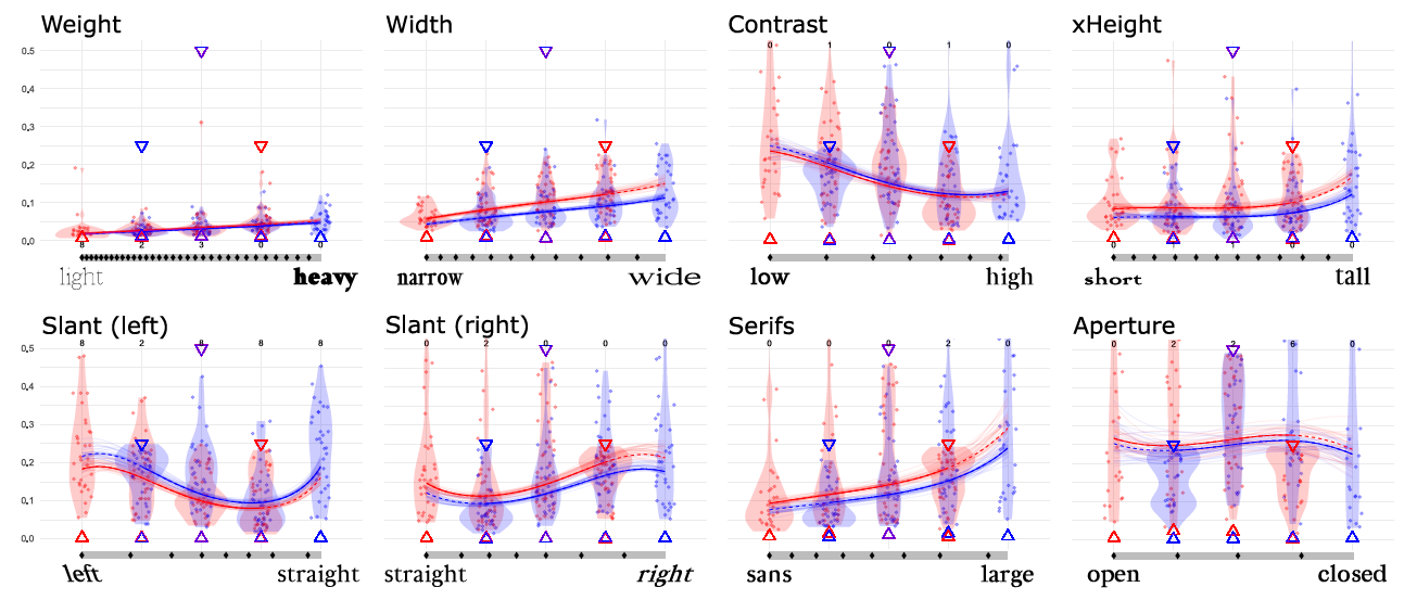
We empirically measured a set of seven common typographic parameters: weight, slant, x-height, width, contrast, serifs and aperture (this last one with combined with junction), characterizing their perceptual effectiveness.

We ran two large crowdsourced studies. In one, we showed people a word rendered with a particular level of a parameter (for example, a heavy weight), and then we asked people to estimate its level between two extremes. In the other, we showed people two words with two different levels (for example, one with more contrast, one with less) and asked them which one had higher contrast (a Just Noticeable Differences study). We also measured the perceptual noise for each of the parameters, and characterized their perceptual curves.
We found that different parameters have different curves. For example, the relationships between the width of a font (in ems) and how people see it, is not linear: the thicker the font, the larger the difference in thickness between fonts has to be to be perceived. For some parameters this is not surprising, since it more or less follows Fechner-Weber’s law. However, for some other parameters there are quite surprising shapes.
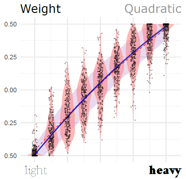
Below is the curve for the weight parameter. Each dot is an instance where we showed a word with a particular level of the parameter. The horizontal position in the plot is what the actual level of the parameter was (for example, if to the right, very heavy weights), and the vertical position of the dot is where the participant placed it in the scale (that is, how heavy they thought it was). You can see in the figure that the curve gets more horizontal the more you move to the right.
But other curves look very different. For example, x-Height (displayed below), has an S-shape, which means that people can differentiate most when the x-Height is about the middle (or closer to most popular fonts), and less at the extremes.

The details are in the paper, but here are two teaser figures of the shapes of all the parameters that we measured:

Another important finding is the ranking that we were able to do of the parameters in order of how distinguishable they are. The two experiments had slightly different tasks, so the rankings are not exactly the same. But here are the rankings (top is best):
Experiment 1
- Slant
- Weight (tied with 1)
- Width
- x-Height (tied with 3)
- Contrast
- Serifs
- Aperture (together with junction)
Experiment 2
- Weight
- Slant
- Width
- x-Height (tied with 3)
- Serifs
- Contrast
- Aperture (together with junction)
How can you use this?
We envision a few ways for you to use what we found:
If you are designing visualizations that contains text
If there is text that belongs to different categories, you can use one or more typographic parameters to visually encode which category the text belongs to. We run an analysis that tells you the chance of confusing one level with other levels for groups of 7, 5, 3 and 2 categories. These are accessible through the extended table of results for Experiment 1 (in MS Excel, look at the columns called splits 7 denormalized, splits 5 denormalized etc) and the extended table of results for Experiment 2 (also in MS Excel, look at the column “Denormalized points”).
If you are planning to map continuous variables, the lists above can serve as evidence to make a choice as to what parameters to choose. The paper also contains an extended discussion on how different typographic parameters might be useful (or not) for certain kinds of mappings. For example, slant can be tricky if not all text is aligned horizontally.
The characterization of the perceptual curves of the different parameters can also help you make your visualization more perceptually uniform. In essence, that means that you compensate for the perceptual variations of the different parameters (in the figure above) so that linear variations of the parameter result in perceptually linear variations of their appearance. In other words, you make it so that a font that sets the weight parameter to double, will look twice as heavy (rather than actually being twice as thick in em units). In order to do this you will have to adapt the most likely curves that we found, with their parameters, invert the curves (i.e, find the inverse function) and convert to denormalized units. This might seem daunting, but all the information necessary is in the paper, and its supplementary materials, as well as the extended table 1 and extended table 2 (in Excel). The supplementary materials of the paper also contain code to normalize and denormalize the curves (in Python). Additionally, we are happy to lend you a hand if you need some direction (send us an e-mail!).
Finally, you can even test our own prototype tool to generate infoTypographic visualizations and maps. It is called typocartographer and it is free!
If you are studying text visualization
We only characterized the parameters that we carefully chose as most representative. We still do not know how well these work in specific visualization contexts, especially for text-heavy data representations. Our results can help you decide where to start looking, and give you some priors. There is so much more to learn, and we think that InfoTypography can be really useful in certain contexts.
You might also be inspired by some of the examples from above. In this case, you might also want to take a look at Brath and Banissi’s papers on the subject, which have a myriad of great examples of mappings and applications (I particularly like this paper).
If you study visual variables / visual channels
We took a Bayesian approach to the analysis of data and designed a very careful study. The materials for both are available in the supplementary materials, and might serve as a starting point to design your own study and analysis of data that might be similar (but perhaps not specifically about fonts). We are sharing the study code, the data, and the analysis with the hope that it helps others; the analysis took a very long time to write.
Resources and Links (internal and external)
- The paper is in the ACM Library, as well as downloadable in this site.
The paper contains useful content, specifically:- A table with details about how each typographic parameter is measured and the range that we tested.
- The data of the perceptual models.
- The exact measurements of the perceptual noise of each parameter.
- The supplementary materials also contain detailed additional detail, such as:
- Extended tables for Experiment 1 and Experiment 2, which provide the optimal locations for differentiability of categories, as well as the exact data of the model.
- Code for the conversion from experiment units (normalized between -0.5 and 0.5) and real-world units (ems and angles).
- The analysis code for the experiment and the data.
- Files with the actual fonts of all the levels that we used.
- The typocartographer service is free and it allows you to create infotypographic designs. We hope it is useful (tell us if it is!), but be gentle, it is still a prototype.

- I found the v-fonts website particularly useful as a repository of variable fonts.
- If you are interested in examples of InfoTypography, you should check Brath and Banissi’s paper.
- About 10 years ago (we are writing this in 2010) we published our work on FatFonts, which inspired this work. You might want to check it out. Here is the paper, and here a website with many examples and downloadable fonts.

♦ Infotypography Research by Johannes Lang (Languste fonts) and Miguel Nacenta (VIXI research group at the University of Victoria) ♦ Download the paper (also here) ♦ Check out the Resources ♦
