(for Type Designers, Typographers, Variable font Designers, and Tool Makers)
Key Takeaways
- Different typographic parameters have different perceptual characteristics.
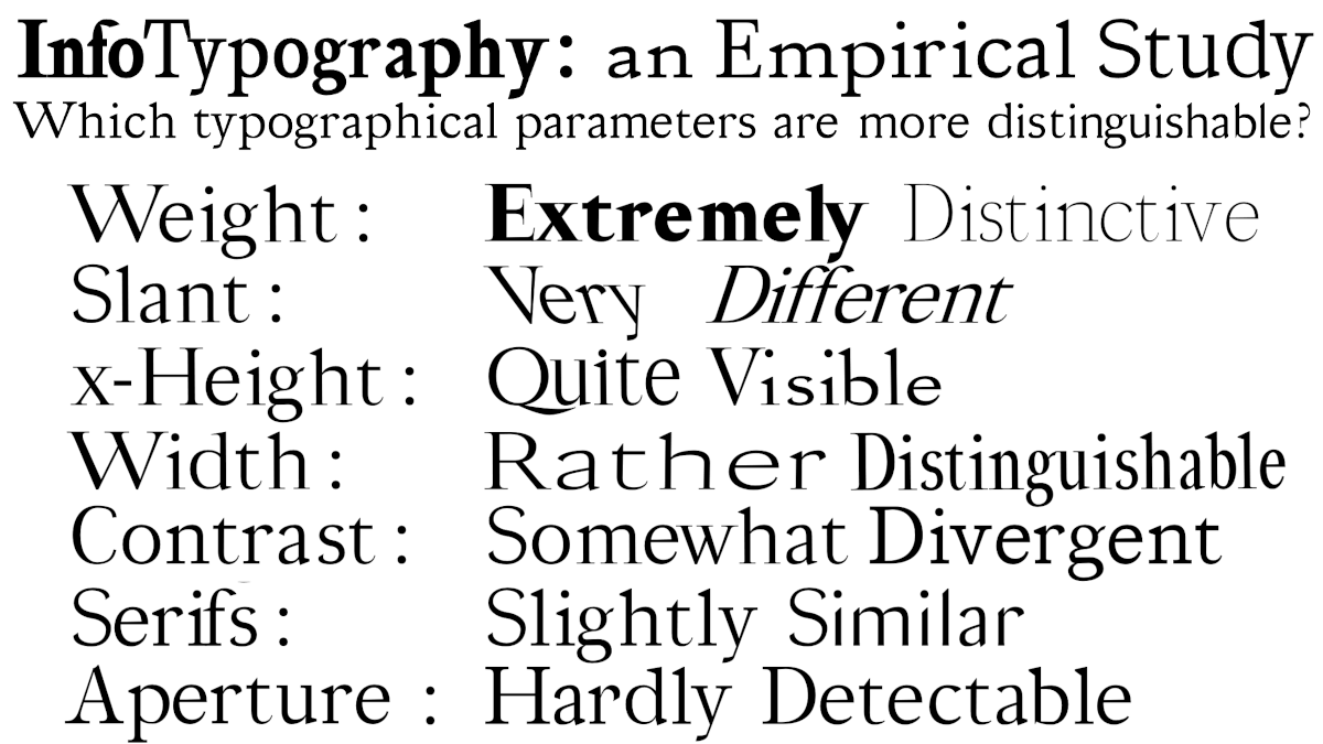
- We studied weight, slant, x-height, width, contrast, serifs and aperture and found them distinguishable by humans roughly in that order (weight and slant are most distinguishable).
- We measured the shape of the perception curves of the different parameters (and, as designers suspected, they are not linear).
- The perceptual curve shapes are different for each parameter.
What did we study and what did we find?
We looked at a set of seven common typographic parameters: weight, slant, x-height, width, contrast, serifs and aperture (this last one with combined with junction).

We ran two large crowdsourced studies on the internet. In one, we showed people a word rendered with a particular level of a parameter (for example, a heavy weight), and then we asked people to estimate its level between two extremes. In the other, we showed people two words with two different levels (for example, one with more contrast, one with less) and asked them which one had higher contrast.
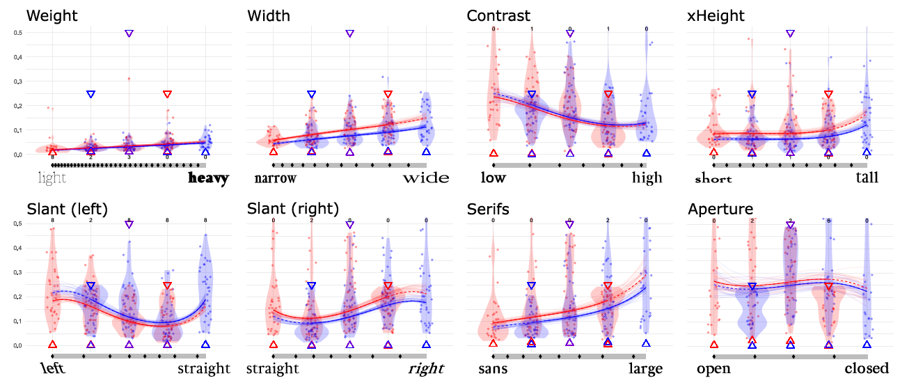
We found that different parameters have different curves. For example, the relationships between the width of a font (in ems) and how people see it, is not linear: the thicker the font, the larger the difference in thickness between fonts has to be to be perceived. We kind of knew about this for weight, but now we have precise measurements, and also we have mapped all the other parameters.
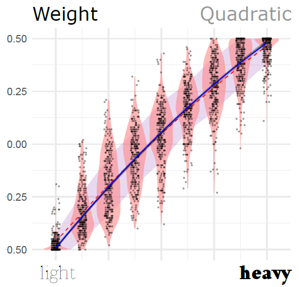
Below is the curve for the weight parameter. Each dot is an instance where we showed a word with a particular level of the parameter. The horizontal position in the plot is what the actual level of the parameter was (for example, if to the right, very heavy weights), and the vertical position of the dot is where the participant placed it in the scale (that is, how heavy they thought it was). You can see in the figure that the curve gets more horizontal the more you move to the right.
But other curves look very different. For example, x-Height (displayed below), has an S-shape, which means that people can differentiate most when the x-Height is about the middle (or closer to most popular fonts), and less at the extremes.

The details are in the paper, but here are two teaser figures of the shapes of all the parameters that we measured:

Another important finding is the ranking that we were able to do of the parameters in order of how distinguishable they are. The two experiments had slightly different tasks, so the rankings are not exactly the same. But here are the rankings (top is best):
Experiment 1
- Slant
- Weight (tied with 1)
- Width
- x-Height (tied with 3)
- Contrast
- Serifs
- Aperture (together with junction)
Experiment 2
- Weight
- Slant
- Width
- x-Height (tied with 3)
- Serifs
- Contrast
- Aperture
How can you use this?
We envision a few ways for you to use what we found:
If you are choosing fonts for a document or document template
If you are choosing fonts for a document or document template you might want to maximize how distinct the different levels and hierarchies of the document appear. We did not measure size of the font (which is commonly used), but you can use the other typographic parameters from our list of studied parameters. We recommend varying weight and width for different headings. A similar thing applies for highlighting content in long swathes of text (see also Strobelt et al.’s excellent study).
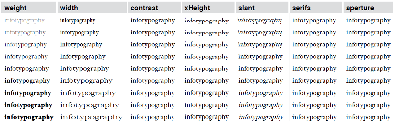
If you want to go even further, you might want to choose the values of the parameters optimally. For this, you will have to choose the number of levels that you want to distinguish and then use the extended table of results for Experiment 1 (in MS Excel, look at the columns called splits 7 denormalized, splits 5 denormalized etc) and the extended table of results for Experiment 2 (also in MS Excel, look at the column “Denormalized points”). These values indicate which levels (for example, which weight thicknesses) to select so that people do not confuse one thickness with another). You will also have to look at how our measurements compare to the family of fonts or variable fonts that you are using (we use fairly standard measurements, but sometimes the details matter; the details are, naturally, on the paper, and its supplementary materials).
If you are designing a family of fonts
If you are a type designer and have to choose which weights to craft for your font, you might want to choose the values of the parameters optimally. But this applies also to other common variations that we see in font families, such as width, or slant. At the minimum, consider the shape of the curves in the figure above. The figure suggests that, with width, you should do as typographers have long done with weight: space the absolute width of your letters more the wider the width gets. However, with contrast, it is the opposite (small contrast changes are more detectable when contrast is high), and with other parameters such as slant, x-height and serifs it is a bit more interesting, since the levels can be a bit closer towards the centre of the range and have to be more apart at the edges.
For a list of values of the different parameters that are perceptually equidistant, you can check the extended table of results for Experiment 1 (in MS Excel). The results are calculated for 7, 5, 3 and 2 levels, and our results tell you how likely one level will be confused with another level. If the expected error is very high for a particular parameter and number of classes, this probably means that you should not waste your effort in designing many variants for that parameter (e.g., it probably does not make sense to make more than 3 levels of serifs). To choose levels of parameters for variants you can also look at the extended table of results for Experiment 2 (also in MS Excel, look at the column “Denormalized points”), and choose levels based on the points there, taking all of them, or in 2’s, in 3’s etc. This will help you make a font family that is more “perceptually uniform”. You will also have to look at how our measurements compare to the family of fonts that you are building (we use fairly standard measurements, but sometimes the details matter; the details are, naturally, in the paper, and its supplementary materials).
If you are designing variable fonts
If you are at the early stages of designing variable fonts, you might be wondering which parameters to make variable. Programming many of them, as in Knuth’s METAFONT system, could be a huge amount of work! Our study might help you decide which ones are most worth it, although this will ultimately depend on the purpose of the variable font that you are designing. More specifically, you can use the lists above to guide your choice.
Additionally, if you want to offer a better experience for the users of your variable font, you could provide parameter variations that are perceptually uniform. In essence, that means that you compensate for the perceptual variations of the different parameters (in the figure above) so that linear variations of the parameter result in perceptually linear variations of their appearance. In other words, you make it so that a font that sets the weight parameter to double, will look like twice as heavy (rather than actually being twice as thick in em units). In order to do this you will have to adapt the most likely curves that we found, with their parameters, invert the curves (i.e, find the inverse function) and convert to denormalized units. This might seem daunting, but all the information necessary is in the paper, and its supplementary materials, as well as the extended table 1 and extended table 2 (in Excel). The supplementary materials of the paper also contain code to normalize and denormalize the curves (in Python). Additionally, we are happy to lend you a hand if you need some direction (send us an e-mail!).
If you are designing tools or user interfaces
If you are designing tools or user interfaces that use text, you might want to communicate clearly the different hierarchies of the different elements, or make them clearly distinct from each other. Our rankings of parameters above will help you choose which parameters to manipulate first. You might also want to use the curves to choose the different levels of the parameter that have optimal distinguishability. We calculated those points for groups of 7, 5, 3 and 2 different categories, which you can find in the extended table of results for Experiment 1 (in MS Excel, look at the columns called splits 7 denormalized, splits 5 denormalized etc). For the second experiment we calculated all the points that would fit in the scale at barely distinguishable distance from each other (what the psychologists call the “Just Noticeable Differences”). You can find those in the extended table of results for Experiment 2 (in MS Excel, look at the column called Denormalized points).
Resources and Links (internal and external)
- The paper is in the ACM Library, as well as downloadable in this site.
The paper contains useful content, specifically:- A table with details about how each typographic parameter is measured and the range that we tested.
- The data of the perceptual models.
- The exact measurements of the perceptual noise of each parameter.
- The supplementary materials also contain detailed additional detail, such as:
- Extended tables for Experiment 1 and Experiment 2, which provide the optimal locations for differentiability of categories, as well as the exact data of the model.
- Code for the conversion from experiment units (normalized between -0.5 and 0.5) and real-world units (ems and angles).
- The analysis code for the experiment and the data.
- Files with the actual fonts of all the levels that we used.
- I found the v-fonts website particularly useful as a repository of variable fonts.
♦ Infotypography Research by Johannes Lang (Languste fonts) and Miguel Nacenta (VIXI research group at the University of Victoria) ♦ Download the paper (also here) ♦ Check out the Resources ♦
