(for Typography and Reading Researchers)
Key Takeaways
- Different typographic parameters have different perceptual curves (non-linear).
- Different typographic parameters have different levels of noise, which is often distributed differently over the range of the parameter.
- Variation in perceptual noise across the participant pool is more stable for contrast, weight and width than for the rest of the parameters.
What did we study and what did we find?
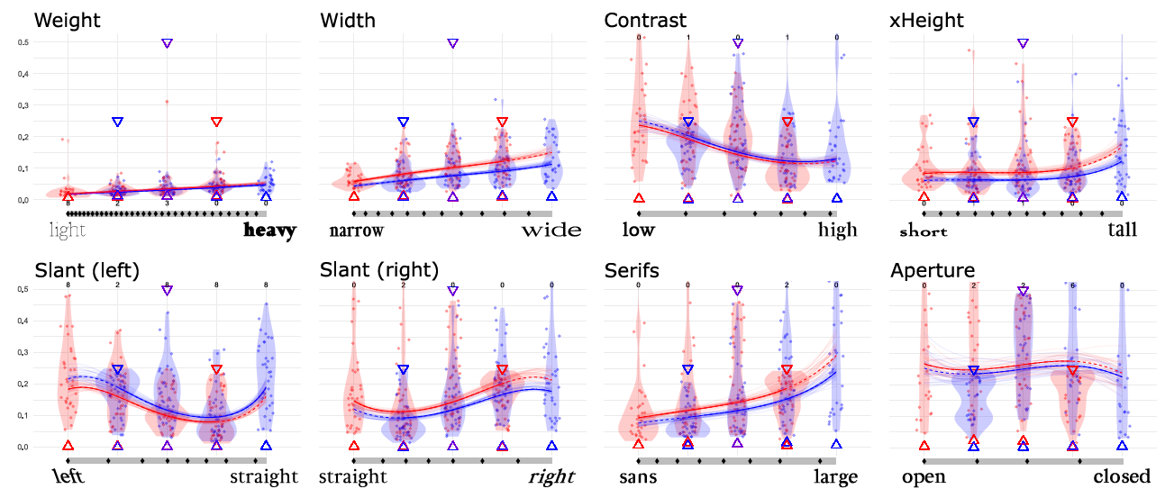
We empirically measured a set of seven common typographic parameters: weight, slant, x-height, width, contrast, serifs and aperture (this last one with combined with junction), characterizing their perceptual effectiveness.

We ran two large crowdsourced studies. In one, we showed people a word rendered with a particular level of a parameter (for example, a heavy weight), and then we asked people to estimate its level between two extremes. In the other, we showed people two words with two different levels (for example, one with more contrast, one with less) and asked them which one had higher contrast (a Just Noticeable Differences study). We also measured the perceptual noise for each of the parameters, and characterized their perceptual curves.
We found that different parameters have different curves. For example, the relationships between the width of a font (in ems) and how people see it, is not linear: the thicker the font, the larger the difference in thickness between fonts has to be to be perceived. For some parameters this is not surprising, since it more or less follows Fechner-Weber’s law. However, for some other parameters there are quite surprising shapes.
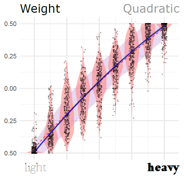
Below is the curve for the weight parameter. Each dot is an instance where we showed a word with a particular level of the parameter. The horizontal position in the plot is what the actual level of the parameter was (for example, if to the right, very heavy weights), and the vertical position of the dot is where the participant placed it in the scale (that is, how heavy they thought it was). You can see in the figure that the curve gets more horizontal the more you move to the right.
But other curves look very different. For example, x-Height (displayed below), has an S-shape, which means that people can differentiate most when the x-Height is about the middle (or closer to most popular fonts), and less at the extremes.

The details are in the paper, but here are two teaser figures of the shapes of all the parameters that we measured:

To our knowledge this is the first such systematic characterization of letter shape distinguishability.
How can you use this?
We want to support further research in the area of typography and typographic perception that is based on careful empirical evidence. We think that our results can serve as foundation for other research.
We share the fonts that we used, which could be used as a neutral reference for comparability in further studies. The measurements that we used are compared to existing fonts (see this additional table which is also in the the supplementary materials) and uses measurements which should be applicable to other research.
We took a Bayesian approach to the analysis of data and designed a very careful study. The materials for both are available in the supplementary materials, and might serve as a starting point to design your own study and analysis of data that might be similar (but perhaps not specifically about distinguishability of levels, or with other parameters). We are sharing the study code, the data, and the analysis with the hope that it helps others.
Resources and Links (internal and external)
- The paper is in the ACM Library, as well as downloadable in this site.
The paper contains useful content, specifically:- A table with details about how each typographic parameter is measured and the range that we tested.
- The data of the perceptual models.
- The exact measurements of the perceptual noise of each parameter.
- The supplementary materials also contain detailed additional detail, such as:
- The full data set (anonymized)
- Extended tables for Experiment 1 and Experiment 2, which provide the optimal locations for differentiability of categories, as well as the exact data of the model.
- Code for the conversion from experiment units (normalized between -0.5 and 0.5) and real-world units (ems and angles).
- The analysis code for the experiment and the data.
- Files with the actual fonts of all the levels that we used.
♦ Infotypography Research by Johannes Lang (Languste fonts) and Miguel Nacenta (VIXI research group at the University of Victoria) ♦ Download the paper (also here) ♦ Check out the Resources ♦
